Showing posts with label VAC. Show all posts

Saturday, November 4, 2017

Picasso's in the Building

"Picasso Red Carpet" 
by Helen Gerro

Each year the Visual Arts Center hosts a Fine Arts Festival during which an artist or artistic period is celebrated. In years past, Art Deco and Art Nouveau, Michelangelo v. Leonardo Da Vinci, Claude Monet and Georgia O’Keeffe have served as motifs.

Each Festival features a line-up of events for both artists and art lovers, from lectures and book discussions to a "sip and paint" evening to a party. But the heart of each Festival is its art exhibit. Replicating paintings done by the masters is a long-established method by which artists learn. And so, in previous years, artists have happily recreated artwork of well-known artists, with some impressive results.

But the law reared its ugly head with the choice of Picasso for this year's theme. Because Pablo died in 1973, his work is not yet in the public domain. And while artists can still copy his work for their own purposes, the sale of those works could run afoul of copyright laws.  Hence, this year's "Inspired by Picasso" theme.

Personally, I like this approach better. Artists still stretch themselves to paint in an unfamiliar style but employ their own creativity in developing the work.

Take, for instance, Robert Pavon's "Girl Before a Mirror." Pavon is an instructor at the Visual Arts Center. Although he works in a variety of media, I associate him with charcoal and pastels. So I was surprised and delighted to see this large oil painting. I love the juxtaposition of his beautifully painted woman with Picasso's semi-abstract girl. (Picasso painted this work during his Cubist period, but she's way too recognizable to be a true part of that genre.)

I was also "wowed" by Helen Gerro's "Picasso Red Carpet" shown above. Gerro is a designer and artist whose studio is in the Atelier in Punta Gorda. Her striking work has graced runways throughout Florida as well as in cities like Atlanta and New York. I'm also taken with her paintings of women, which are bold and bright and leave a lasting impression. (To see more of Gerro's work, click here.)

"A Picasso Wedding" by Barbara Albin
One of my favorite works in the show is a collage done by Barbara Albin. The story behind it is just so great. Straight out of school, Barbara was living in Chicago and dating a fellow artist by the name of Wayne Albin. They decided to get married, but it had to be just the right place.

A Chicago newspaper had a "wanna be" column to which people would write with their dreams. Barb had an idea. "Dear Beeline," her letter read, "We "Wanna Bee" married in front of the Picasso sculpture in the Loop. The Picasso seems somehow appropriate because art is what brought us together." (This letter is, of course, part of the collage.)

Imagine Barb's surprise when she got a call from the paper asking if she and Wayne would rather get married on Friday or Saturday of the following week. The couple said their vows a few days later in front of Picasso's five story statue in Daley Plaza with friends and family surrounding them.


I'd be remiss not to mention the creativity and talent of our 3D artists. Only Belinda Duclos would have the guts to create a Picasso-inspired stained glass work. Her "Monolithic Act in Two Parts" was modeled after Picasso's "Monolithic Nude." His work happens to have a line smack dab in the middle of the woman's body that provided the perfect place for Belinda to break this work into two parts.

Like Pavon, Belinda is an instructor at the Visual Arts Center. She teaches stained glass and silver and copper jewelry making. (She has some jewelry in the exhibit as well.)  Her students always seem to be having way too much fun, particularly when they're doing metal work. As we say, Belinda and her students play with fire -- literally.

If you're in Southwest Florida, swing by the Visual Arts Center before November 30 and check out the exhibit. Better yet, take in the exhibit and join us for some of the other fun events!  For a listing, go to http://visualartcenter.org/.


Saturday, February 6, 2016

Looking at Art with Jeffrey T. Larson

One of the perks of chairing the National Art Exhibition at the Visual Arts Center is having the opportunity to get up close and personal with the juror for the show. And while it's always fun to watch the juror as he goes through the judging process, this year's experience with Jeffrey T. Larson was, in a word, fabulous. 

David's "Napoleon Crossing the Alps"
Jeff studied at Atelier Lack, a program that "focuses primarily on teaching fine draftsmanship and painting skills leading to the creation of well constructed artwork."  What's cool is that the instructional lineage of the school can be traced back to the Neo-Classical artist Jacques-Louis David who painted, among other famous works, "Napoleon Crossing the Alps."  

Jeffrey Larson's "Electrolux"
So it comes as no surprise that Jeff is a representational artist focused on the craft of painting (although you might not put his "Electrolux" up against David's "Death of Marat" and immediately see the connection.)  As an aside, when asked about the painting, Jeff shared that his mother-in-law had told him and his wife Heidi that if they ever came across an Electrolux, they should snap it up. They found one at a garage sale and did as instructed. Although it didn't work well as a vacuum cleaner, Jeff found the streamlined design of the machine an interesting subject.  

Jeff's first introduction to the 134 works he had chosen for this year's show (from a field of 633) came when he and Heidi walked into a gallery overflowing with artwork. Paintings hung in a haphazard fashion on the walls; some were on the floor leaning. Despite the chaos, a smile broke out across his face as he saw the artwork he'd previously viewed in 3x3 thumbnail photos online.  He was happy with his selections. "Every work," he said, "Has something, a little spark." 

Anna Bain "Self-Portrait in the Studio"
The hardcore judging took place the next morning, which Jeff spent studying the works and eliminating. Eventually, the only paintings hanging were those he was considering for a prize. Co-chair Ingrid Carroll's and my job was to be on hand to answer basic questions -- more or less to be flies on the wall as the judge went about his business. But Jeff was downright voluble as he shared his thoughts with us about different works. 

He turned Anna Bain's "Self-Portrait in the Studio" upside down to look at the composition. (I'd seen this trick before in a critique session, but it's always striking. It was funny when someone came into the gallery and said, "Well, I guess that work's out of the running."  Au contraire.) He loved the work's balance and the way all lines led to the artist's face. The work received Second Prize in the show.

Dominic Avant "Pizzicatto"

He talked about his characterization of Dominic Avant's "Pizzicatto" as a genre piece rather than a portrait. Knowing that Dominic's 14-year old son had sat for this painting, I was curious about the difference. In a portrait, he said, your focus is on the individual. Who are they? What are they thinking? In a genre work, the focus is on the setting, the activity. The motion of the cellist's hand as he plucks the strings draws the viewer's eye rather than his face. The work received Third Prize in the show.

Bill Farnsworth "On the Line"

Bill Farnsworth's "On the Line," which won Best of Show, captured Jeff's attention because of the way the artist created different points in the painting that draw the viewer's eye in.  Some paintings, though skillful, lead your eye off the canvas and onto the next work.  Farnsworth's dollops of light and the sense of movement from the waves force the viewer's eye to keep circling around and considering the work. It's a manipulative artistic technique that an uneducated viewer (like me) might not even realize is happening. 

James Wolford's "Friendship House"
It was interesting to hear Jeff comment that he could tell certain works had been painted from a photograph.  How did he know, you might ask (as I did).  Jeff pointed out that when the human eye is looking at, say, a house, you focus on one point and the hard edges soften. (He referred to them as "lost edges.")  In James Wolford's "Friendship House," the rooflines are uniformly distinct, a sign the artist painted from a picture (after, Jeff was certain, many studies of the work).  Photo-realistic paintings are neither good nor bad, just a technique that the viewer might appreciate. (While "Friendship House" did not win a prize, Wolford's "USS Constitution" garnered an Excellence Award.)

The National Art Exhibition will be on display at the Visual Arts Center through March 12. If you're in the area, it's a show worth seeking out -- even if you don't have the benefit of Jeff Larson's commentary along the way. And for a bit more insight into the show, check out Nancy Stetson's article in Florida Weekly: A Good Year for Art.


Sunday, July 12, 2015

Canvas for a Cause

Intimidation personified

To the best of my recollection, the last time I picked up a paintbrush to do anything other than slap some paint on a piece of furniture was when I was in elementary school.  And so it was with great trepidation that I signed up to paint at Canvas for a Cause, a collaborative fundraiser between the Visual Arts Center and AMIKids/Crossroads.  Seriously, is there anything more intimidating than a white canvas that you're expected to fill?

Bev with her painting


The wanna-be artists were set up in the VAC's galleries and led through the process by instructors Beverly Yankwitt and Kathleen Kelly.  Knowing that Bev is primarily an abstract painter, I pulled a few strings and got my group assigned to her room.  I figured the less representational my work had to be, the better.  (This is not meant to demean in any way the beauty and power of abstract art.  As Bev noted in her preamble to the evening, it is actually more important for abstract art to follow the principles of design.  There is, however, less drawing involved.)


With our "palettes" (okay, plastic plates) readied with red, white and blue paint, Bev told us to start from the top with the blue.  From there, it was a free for all.  It seemed I barely had any paint on my canvas before she said we should move on to the red.  What???!!!  It's possible I was spending too much time enjoying the yummy food (made by Event Elements), but I suspect that my desire to get it "right" was more to blame.  (Note: Check out how much work Jane Patton--in the row behind us--has done on her painting. Of course, she's a real artist, but still.)


Time flew, and I amazingly didn't even notice the spectators who were watching our flags unfurl on our canvases.  I particularly enjoyed tapping the paintbrush against my finger to get the white specks (stars?) on the painting. Of course, I had anticipated carefully placing each little speck of paint on the canvas with one of the smaller brushes.  Can you say "type A personality"??? 


Most people had finished up and moved on to socializing by the time Janice, Kathy and I were ready to declare our works done.  And while I certainly didn't miss my calling, I have overcome my fear of participating in a paint party. And who knows?  Maybe I'll even get myself to one of the monthly Corks 'n' Canvas nights at the Visual Arts Center.  Good, bad or indifferent, there is something magical about the creative process. 


Saturday, April 25, 2015

Critiquing Your Artwork with Ileane Taylor


Ileane Taylor
One of the perks of being a member of the Visual Arts Center is attending its Artist Development series. Although I am not an artist, I love these get-togethers. They allow me a glimpse into the artistic process while teaching me a thing or two that enhances my art appreciation. Plus they're just plain fun. The latest session on critiquing your own artwork with Ileane Taylor was no exception.

From the time Ileane began taking art lessons at age 14, critiques were a part of her process. That doesn't mean she has become immune to the sting harsh words (or, even worse, silence) can leave when she asks a friend or fellow artist for her opinion on a work in progress. She is a firm believer, however, that constructive commentary is necessary to grow as an artist.  With that in mind, she gave a quick overview of the components of pictorial expression she would use as her reference point for the rest of the afternoon:  Motivation, Composition, Drawing, Focal Point, Color and Emotional Response.


"My Husband's Hands" by Ileane Taylor
Ileane looked at some of her own paintings with a critical eye before sharing her thoughts about other artists' works. First up was a painting entitled "My Husband's Hands." Ileane's motivation for creating this image was her fascination with her husband's fingers. Over the course of their marriage, they have grown from a size 6 to their current size 12 1/2. She shocked the group by using chalk to draw an arch on the painting to emphasize its composition. (As the artists squirmed in their seats, Ileane reassured them that she wouldn't do this to their works.) Ileane talked about the importance of getting the anatomy of the hands right and the use of lights and darks to invoke a somber, contemplative mood.  Overall, she feels this is a successful work.


"Peaches and Owls" by Ileane Taylor
Ileane wasn't as easy on some of her other paintings, particularly her "Peaches and Owls."  What was she thinking, she asked, when she decided to pair a burrowing owl with peaches?   With a quick scratch of chalk, she showed how the composition of the work is out of balance, with an unclear focal point.  And, she wondered, how long would the little owl's legs actually have to be to reach to the bottom of the plate on which the peaches are resting?  At the end of the day, she said there is "so much wrong with this painting" that she'd start all over again if it were a work she wanted to hang.


Work by Thelma Daida
Thelma Daida was the first artist to share a work for the group's critique. Thelma is an abstract artist, which gave Ileane the opportunity to talk about the difference between intellectual and non-intellectual abstract paintings.  In an intellectual abstract, the viewer can discern images in the painting that provide a reference point.  Non-intellectual abstracts--like this one of Thelma's--rely solely on form, color and line for their impact.  The group liked the work with its strong colors and composition. The focal point is a Chinese character in the upper left quadrant.  There was some discussion about whether the work would benefit from a second character. Ileane's suggestion:  cut one out and see! 


Joy Sanders' lovely work provided an opportunity to talk about light and shadows. The sun shines through the window and hits the woman's back, which would leave her face in the shadows. Similarly, the white chair should be a bit grayer given the lighting in the room. The chair also draws the viewer's eye to the edge of the canvas (which violates Ileane's "no fly zone" rule of not having important elements within an inch of the edge of the picture). So, while the painting might faithfully replicate the reference work, Ileane felt that it would benefit from a bit more attention. 


Work by Joan Balmer
Over the course of the session, we looked at more than a dozen creations.  It was pure coincidence that the last work was unanimously lauded by the group as highly successful.  This fiber work by Joan Balmer depicts aquatic life and mangroves in a balanced, colorful and engaging way.  The use of netting to demark where the water line would be is nothing short of brilliant.  It was the perfect note on which to end the afternoon.

Wednesday, January 28, 2015

How Small Can You Go? Visiting the 40th Annual Miniature Show

When my friend Maggie made her plans to visit, I put on my tour guide hat and searched for fun things to do while she was here.  We had plans to visit the Dali Museum in St. Pete to see the Picasso-Dali, Dali-Picasso show, so a stop at the 40th Annual International Miniature Art Exhibition in Tarpon Springs seemed like a good add-on.  It's a wonderful--and slightly mind boggling--show.

Kathy Pollak at work
Our first stop was a chat with Kathy Pollak, one of the demo artists that day.  Pollak used to do "normal painting," but turned to miniatures when she and and her husband moved to Florida and downsized.  (We heard this from some other artists we spoke with as well.  Everyone can find a space in their home for a miniature!)  In order to qualify as a miniature, the work itself can be no more than 25 square inches; the maximum framed size is 64 square inches.  Also, as a rule of thumb, the miniature should be no larger than 1/6 the size of the actual object. (Just for kicks, I got out a measuring tape and measured my head, which is approximately 9 inches tall.  This means my face in a miniature portrait should be no larger than 1 1/2 inches.)  

Pollak starts her process with a picture of what she wants to paint loaded up on several devices (plus a hard copy).  The version on her iPhone (not the gargantuan iPhone 6 plus) was the actual size of the painting she was working on the day we chatted with her.  She begins either by tracing the picture onto her canvas (which she called the "cheaters' method") or by drawing the image with the use of calipers to measure the distances.  Either way, the artist then has to paint the detail of the miniature, which requires an inordinate amount of skill and patience.

"Cottage at the Cape" by
Polly Berlin (oil)
With this background, we began to explore the lighted cases filled with miniatures.  A magnifying glass hangs by each case so visitors can take a closer look at the detail of works that catch their eyes.  Maggie almost immediately gravitated to this painting by Polly Berlin entitled "Cottage at the Cape."  The texture and detail of the flowers are incredible. In a happy coincidence, Maggie's mother collected miniatures that are housed in a family home on Cape Cod.  It was an easy decision for her to add this work to the collection.

"The Colors of Robin Williams"
by Rebecca Kessel (acrylic)
The exhibit contains a wide variety of styles and mediums. Essentially, any type of work done in "regular" size can be done in miniature.  There were watercolors and sculptures and multi-media works and drawings. The subject matters were equally varied, from portraits to landscapes to animals.  Abstract works are specifically permitted under the prospectus for the show, but both Maggie and I felt they don't translate particularly well into the miniature format.

"Gypsy Horse, Cherokee
Rose" by Denise
Horne-Kaplan
Submissions have to be juried into the show.  If I understood correctly, there is a panel of five jurors and majority rules.  A judge then selects the winners.  Prizes are awarded in each medium and in a number of subject-matter specific categories.  First prize for opaque watercolor went to the Visual Arts Center's own Denise Horne-Kaplan for "Gypsy Horse, Cherokee Rose."  The work measures 2 1/2" by 4 1/2".  Even in my picture, you can see the amount of detail.

"The Road to Coomenole Beach,
Dingle" by Joan Cart (opaque watercolor)
The exhibition is an annual event and is held at the Leepa-Rattner Museum in St. Petersburg.  This year's show runs through February 15.  It's really a must-see for any art lover (and, in my opinion, much more interesting than the Picasso-Dali, Dali-Picasso show).  I am already looking forward to next year's show.


Wednesday, November 12, 2014

Touring South Beach's Art Deco District

I never thought I'd be one of those tourists getting off a bus and gawking at the sites around me.  And yet I found myself doing just that last week when I went with a group from the Visual Arts Center to South Beach to tour the Art Deco district.  The event was part of our 2014 Fine Arts Festival entitled "Sensuality Meets Symmetry: Art Nouveau to Art Deco."  (Art Deco being, of course, the "symmetry" part of the equation.)  It was a blast. 

The moment we rolled into town, I knew I wasn't in Kansas any more.  Latin music blared all around us.  Beautiful young people strolled the streets (many wearing swimsuits -- and we're not just talking the women).  Restaurants beckoned from every nook and cranny.  And then there was the gorgeous Art Deco architecture we were there to see.

We started at the Miami Design Preservation League's Art Deco Welcome Center right on Ocean Avenue (and just steps from the beach). Our tour guide, Maureen, gave us an overview before we started the tour proper.  I never knew that Miami Beach had no beach when it was first developed.  It was just mangroves and water.  So all of South Beach is man made (as, Maureen aptly pointed out, are many of the women's bodies!) Or that during WWII, the Army Air Corps rented the hotels on Ocean Avenue to house more than 500,000 cadets who came through the training program there. (The local golf courses were turned into landing strips for the training exercises.) 

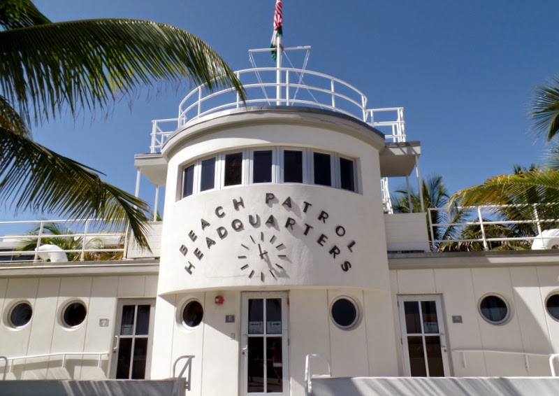
The information came at us fast and furiously as we walked around Ocean Avenue.  Our first stop was Beach Patrol Headquarters built by Robert Taylor in 1934.  It's a terrific example of Nautical Art Deco, with porthole style windows, a captain's bridge, piped railings and curved air vents.  Before the MDPL built its headquarters between Ocean Avenue and Beach Patrol Headquarters, it apparently looked like an ocean liner that had run aground.  (I'm not sure why that was an appealing design style!)

The Congress Hotel is still in business and is now comprised of four separate buildings with different architectural styles. The original building is straight up Art Deco, with its ziggurat (step down) details and "frozen fountain" reliefs.  Other Art Deco features include "eyebrows" over its windows and many geometric patterns.

Maureen explained a bit about what it means for a building to have a historical designation.  "The facade is all," she said.  Preservationists realized early on that the Art Deco district needed to thrive economically in order to survive. And so while owners of historic buildings are required to keep the exteriors as they were originally constructed (with repairs made using authentic materials), they have the freedom to do whatever they want in the inside.  As a result, you might stand across the street admiring a perfectly restored Art Deco building and then wander in to find decor like this tropical beauty.

While South Beach is known for its Art Deco, there are other styles of architecture there as well.  This Mediterranean Revival home is the third most photographed residence in the United States (after the White House and Graceland).  But it's not the Moorish influences found in this building that create its fame.  It was here that designer Gianni Versace was gunned down in 1997.  The building was sold in 2013 for $41.5 million and made into a luxury hotel.  There are bouncers at the door to make sure you don't get any further than the entryway without a reservation.  (If you're interested in seeing some photos of the interior, check out this article from the New York Daily News.)

The Miami Design Preservation League guides did a wonderful job sharing a bit of South Beach history with our group.  I feel like I've just scratched the surface, though.  In addition to the Art Deco tour we enjoyed, MDPL offers self-guided Art Deco tours, guided MiMo tours (MiMo being Miami Modern) and even a South Beach for Foodies tour.  And of course they host the annual Art Deco week-end, which will be held next year from January 16-18.  As our favorite former governor of California would say, "I'll be back." 

Wednesday, October 29, 2014

Let's Look at Titles with Dorothy Howe Brooks

Jane Spencer with Dorothy Howe Brooks
Not being an artist, I have never faced the task of coming up with a name for a piece of art. I can appreciate the challenge, though, as I often struggle to come up with titles and subheadings when I'm writing a feature for Florida Weekly.  And so I was interested in poet Dorothy Howe Brooks' insights on the art of naming an artwork at the Visual Arts Center last week.  It was loads of fun.

By way of introduction to her subject, Dorothy talked about the difference between titles of poems/other forms of literature and titles of artwork.  In literature, the titles are front and center.  They are cues that give the reader a sense of what is coming up and influence whether you want to forge ahead into the writing.


In art, titles tend to be secondary.  When you walk into a gallery, it is the artwork that beckons.  When a work grabs your attention, you go closer to get a better look.  Then you might look at the wall card to find out who painted the work and what it's called. A good title will enhance your appreciation of the work.  A bad title runs the risk of turning you off.  


O'Keeffe's "Red Hill and White Shell"
The most common type of title is fact-based. "This is a painting of xxxx," the artist tells the viewer. This approach establishes a context and can be particularly illuminating for more abstract works. Dorothy used Georgia O'Keeffe's "Red Hill and White Shell" as an example.  Most everyone recognizes the nautilus shell, but the fact that the background is a hill often eludes viewers until they learn the name of the work.  The title adds to the viewer's experience as it piques their curiosity as to whether such a hill really exists in nature. 

Patricia Anderson Turner's "Mud cookies" 
We talked a bit about how a factual title can establish the political context of a work. Sue Taylor shared how struck she had been by Patricia Anderson Turner's social commentary pieces, particularly her “Mud Cookies.”   At first glance, you see a colorfully dressed woman holding some disks.  The title was intriguing, however, and led both Sue and me to read Patricia’s explanation of the work.  We then learned that the disks are “cookies” made out of mud that Haitian women feed their children.  This was a very powerful use of a fact-based title. 

Dorothy categorized other ways to title works for us.  A title can focus attention on a particular aspect of a painting.  Monet’s “Impression Sunrise” draws our attention to the glimmering light as the sun rises on the day.  A name like “Harbor at LeHavre” (the original title of the work) is informative, but doesn’t share with the viewer what really struck the artist about the scene.

"Study in Blue and White" by Dana Cooper
Other types of titles might reveal the artist’s inspiration in a common narrative (a myth, perhaps, or a historical event).  Or it might focus the viewer on a craft element of the work, like Dana Cooper's "Study in Blue and White."  A title can name an emotion being expressed by the artist (an approach Dorothy does not favor because it seems to dictate what the viewer should feel).  Finally, an artist might go with “Untitled” as the name of her work, leaving its interpretation wholly to its audience.

Carol Fogelsong's work
 Then the real fun began as Dorothy showed us some works without revealing their titles and asked us to suggest names.  First up was this work by Carol Folgelsong.  We quickly realized how hard it is to develop a good title (particularly, as one artist suggested, for a work you didn’t create). Suggested titles were “Flight’s End,” “Captured,” and “Out of Reach.”  We talked about how the bright colors evoked a happy, whimsical feeling that was contrary to some of the names we’d come up with.  (FYI, Ms. Fogelsong named her painting “Lost and Found.”)

Becky Donatucci's work
We also brainstormed to come up with a name for this painting by Becky Donatucci.  So many different types of titles could work for this one.  A fact-based title could name the cemetery or what is presumably a church.  You could call it something like “Blue Door” (an approach many people favored).  Someone suggested “Before and Beyond,” a title that uses a metaphor.  Another person proposed “Perspective of Shadows,” drawing focus to the craft element of the work.  Ms. Donatucci went with this approach, titling her work “In the Shadow.” 

The session was engaging and thought-provoking and lots of fun.  I surely will pay even closer attention to the titles of artwork in the future as I consider what they add to my experience.  Let the viewing begin!       

Saturday, September 27, 2014

Art Criticism at the Visual Arts Center

The mere thought of picking up a paintbrush or a piece of clay strikes terror in my heart. (Sadly, I kid you not.)  And yet I found myself at a session last week on "How to Critique Your Art" at the Visual Arts Center.  The session was the first in our new artist development series.  And while it was obviously geared towards artists, I was not the only person in the room who is "only" an art appreciator.  I always figure the more you know, the better!

The session was led by Liz Hutchinson, a leading artist in our community.  Liz talked a bit about ways to look at art--objective, subjective, with imagination--and then asked for the first volunteer.

Sculpture by Judi Roth
Judi Roth offered up three beautiful small sculptures.  This work features a teeny tiny bird's nest. The whimsy, patterns and texture of Judi's pieces delighted the group.  Liz was struck by the fact that the piece wasn't circular as you might expect.  (Another of Judi's pieces was a bird bath--complete with a rubber duckie--that had a notch cut out.)  She suggested that Judi's "trademark" might be the unexpected shapes of her works.  This thought prompted Liz to share with the group her advice when an artist asks how to develop his own style.  Her response:  "Take an aspirin and call me in the morning!"  She assured the group that an artist's style will emerge naturally if you give it time.

"Rowing Ashore" by Lyn Jensen
Lyn Jensen's stunning digital photo brought a lot of commentary from the group.  Lyn explained a bit about the process, which involves layering several photos into the final work.  Liz admired the way that the light shines through the leaves, noting that without that element, the darkness would overwhelm the work.  Someone mentioned the "accidental associations" that viewers bring to a work -- in this case, the book "Boys in the Boat" (which Lyn wasn't familiar with).  I fell in love with the colors, which reminded me of an early morning in Nova Scotia.

Jane Patton's work
 I was surprised by Jane Patton's work, which depicts her husband Tom with a nice-sized bass.  I associate Jane with botanicals and enjoyed seeing her venture into another subject.  Liz's first question was "Where are we?"  Jane and Tom used to live on a lake, and Tom would sometimes come home from work for lunch and do a bit of fishing (hence the starchy white shirt and tie -- a contrast that immediately made everyone smile).  Liz used Jane's work as an opportunity to talk about the color spectrum.  Apparently yellow is the "hottest" color and should be used judiciously.  The brightness of the dock, while perhaps reflective of its color in real life, is a bit overwhelming and makes it hard to see Tom's hand.  Liz encouraged artists to take a step back in the midst of their painting and ask themselves what their work is about.  Here, the painting is about Tom and his fish, not the dock.  So you don't want the dock to be what people's eyes are drawn to when they see the picture.  (Jane told me she's reworking the dock to add more gray.  I liked the work as it was and am interested to see the revised version.)

Michael Cahak's work
I had stepped out of the room when Michael Cahak explained the medium for this abstract, which reminded me of an encaustic.  (It was on a piece of paper, though, so I know that's not right.)   Abstracts in particular are hard for people to comment on.  Perhaps more than any other style, you either immediately like it or not.  (This is my comment, not Liz's.)  Her approach to the work was interesting.  She turned it horizontally and upside down from the way Michael intended it to hang and asked the group which way they liked it best.  Surprisingly (to the artist), the group preferred the work on its side with what looks to me like tree branches hanging down.

Mary Lou Miller's painting brought lots of "oohs" and "aahhs" from the group.  This photo really does not do justice to the amazing colors in this watercolor, although you do get a sense of the texture Mary Lou created in the nest.  Liz didn't have much commentary about this work (which she proclaimed a "seller")  other than that the baby herons add to its interest.

It was an interesting and engaging 90 minutes.  I enjoyed some of Liz' other tidbits of advice for the artists, like how to respond to questions about how long it took to create a painting ("35 years, 8 months and 4 days" -- i.e., the artist's lifetime) and to remember that "putting a frame on a painting is like putting a dress on a woman."   I am already looking forward to the session next month on "How to Name Your Work" that will be led by poet Dorothy Howe Brooks.  There's always something fun going on at the Visual Arts Center!

Monday, July 14, 2014

A Visit to the Morse Museum

Each November the Visual Arts Center hosts a month-long festival that celebrates an artist or artistic period.  This year's festival is entitled "Sensuality Meets Symmetry:  Art Nouveau to Art Deco."  Local artists will fill one of our galleries with artwork that replicates--or is inspired by--the creations of artists from these periods.  There will be workshops and a party and a bus tour to South Beach to tour the Art Deco district.  It is going to be a lot of fun.  (In the interest of full disclosure, I will tell you that I am co-chair of this year's Festival, so I am particularly enthusiastic about our events.)

Me, Jennifer and Sue in front of a stained glass window
from Tiffany's Long Island estate (Laurelton Hall)
The Festival typically has an educational component as well, and this year is no exception.   When I was trolling the internet, I came upon the website for The Charles Hosmer Morse Museum of American Art in Winter Park, a mere three hours from Punta Gorda.  The Museum houses the world's most comprehensive collection of works by Tiffany, including windows, jewelry, pottery and his chapel interior from the 1893 World's Columbian Exposition in Chicago.  Whoa!   As I continued to look through the Museum's website, I noticed that Jennifer Perry Thalheimer, Curator and Collections Manager of the Museum, had given a lecture last year entitled "Forms and Themes of Art Nouveau from the Morse Museum."  Bingo!  Jennifer has graciously agreed to come to the Visual Arts Center to give her lecture on November 13th as part of the Festival.  And so my friend Sue Krasny and I decided to go on a reconnaissance mission to the Museum to check out the collection and meet Jennifer before she hits Punta Gorda.

Library Lamp
The Museum's collection is unbelievable in both its scope and its beauty.  As we stepped through the door, we looked to our right and saw the gorgeous window shown above (which we were able to get our picture with only because we were with "the boss").   Then we looked to our left and saw a dozen or more stunning Tiffany lamps on display.   It was a feast for our eyes.

We met Jennifer and she took us on a quick tour of the Art Nouveau room whose objects will be the subject of her lecture.  The room is organized around five themes:  the exotic, nature, line, female form, and metamorphosis.  I have to admit that I was only half-listening to what she was saying because there was so much to take in.  Suffice it to say, though, that there's a lot more to Art Nouveau than its beauty.  There's even a link to the suffragette movement (but I won't divulge the connection here -- come to the lecture to find out about it!)

Chapel interior from 1893 World's Fair
Later Sue and I made our way to the Chapel interior that was the Tiffany Glass and Decorating Company's exhibit at the Chicago World's Fair in 1893.  The exhibit was so popular that Tiffany reinstalled the Chapel in his studio in New York City after the World's Fair was over.  In 1898, the Chapel was installed in a different form in the crypt of the then-new Cathedral of St. John the Divine.  There was some controversy around the Chapel that resulted in it falling into disuse and disrepair. In 1916 Tiffany reacquired the Chapel and brought it to his Long Island estate Laurelton Hall.

The Chapel on display in the Museum is all original (with the exception of two benches). When we entered the room, the lights were dim; over time, the room seemed to brighten.  My eyesight not being what it once was, I asked the guard if it was my imagination.  She laughed and said that the lights are on an eight-minute timer to give people the chance to view the chapel in varying levels of brightness.  The lowest lighting level is reflective of how the Chapel was displayed at the World's Fair.   It is an amazing exhibit.

Daffodil Column
We then toured the 12,000 square foot Laurelton Hall wing of the Museum, which opened in 2011.  (While this is sizable, the real Laurelton Hall was a whopping 84-room, 37,000 square feet home built on a 580 acre estate.)   The Daffodil Terrace was particularly inviting with its 11 foot marble columns topped with bouquets of glass daffodils.   The Terrace, which is comprised of more than 600 components, is the Museum's most significant restoration project since the Chapel interior was reassembled.

Other rooms that have been recreated include the dining room, the reception hall and Tiffany's study.  In total, more than 200 items are included in the exhibit, and it gives the viewer a sense of the world in which Tiffany lived.

With that, we were on our way back to Punta Gorda.  It was a wonderful outing, and Sue and I agreed that we can't wait to go back.  Perhaps a visit during the Winter Park Sidewalk Art Festival in March is in order.  (This annual show boasts over 200 vendors culled from an applicant list five times that number.)   For the time being, I am looking forward to learning more about Art Nouveau and the Museum's collection when Jennifer gives her talk in November.  Consider yourself officially invited to come and join the fun!


Saturday, February 8, 2014

And the Winners Are.....

First Federal Gallery at the Visual Arts Center was standing room only last Thursday night as the winners in the National Art Exhibition were announced.  The winners had been told the week before that their works had been awarded a prize, but they had not been informed exactly what that prize was. With 16 prizes in all, carrying cash awards ranging from $100 for a Judge's Recognition Award to $2000 for Best of Show, the artists were particularly eager to find out the results.  It was a fun night, with lots of "oohs" and "aahs" from the audience as pictures of the winning works were flashed onto the big screen. 

"Her Favorite Hat" by Hodges Soileau
Best of Show was awarded to "Her Favorite Hat" by Hodges Soileau. Juror Carl Samson provided commentary about each of the winning works, and he said of Hodges' painting:  "Enchanted with this one.  Extraordinarily subtle technique.    Lovely design.  Beautiful drawing.  Varied texture handled extremely well."   In last year's National Faces and Figures exhibition, Hodges won second prize for his work "The Red Pillow."  Interestingly, when I showed Hodges where his painting had been hung -- right outside the door to the administrative offices -- he said, "That's where my painting was last year."  For the record, the hanging committee is not privy to prize winners when they figure out the difficult task of how to display the show. 

"Hesitant" by Dominic Avant
Second Prize was awarded to Dominic Avant for "Hesitant."    The juror said of this work:  "Expert handling of dappled sunlight.   Figures are well drawn and articulated.  Trees are wonderfully designed and specific.  Overall light effect is spot on."   Avant is also a fixture in the winners' circle at the VAC.  He was awarded third prize in last year's Faces and Figures show for "Listen," a painting of his older son whispering into the ear of a horse.  This year's work shows both of his sons venturing into the water.  Dominic shared that his older son is about at the age where he wants to get out of the modeling business.  With the success he is having using him as a model, he might want to up his allowance!

"The Turban" by Sharon Hutson
Third Prize went to a newcomer to the scene -- Sharon Hutson for "The Turban."  The show was only the second that Sharon has entered, and she was thrilled.  Sharon shared that she generally has used family members, who are of Danish descent, as the models for her work.  She wanted to try something different, and ended up with this Middle Eastern gentleman and his amazing textiles.  The juror said of this work:  A sensuous feast of color, pattern, and subtle handling.  Nice breadth of treatment with great "wall power."

I will end the way the evening started.  The Visual Arts Center is keen to promote the ways that various art forms work in tandem.  Dorothy Brooks is a local poet whose work includes the book "A Fine Dusting of Brightness."  We asked Dorothy if she would pen a poem after she viewed the show.  Her reading of "Other Voices" kicked off the reception.  I'm sure that you will enjoy it as much as we did.  

(Overheard at opening: “I imagine every painting
has a story.”)

OTHER VOICES by Dorothy Brooks

Come. Enter the deep, deep silence
of this space. Be still. Listen.

You who spend your days
in shadow, unable to truly see

a rose or morning dew, who hear
always the noise outside: televisions,

cell phones, the constant chatter—
step into this silence

around the edges of the picture frames.
Let it surround you. Dwell in it.

Soon you will begin to hear
other voices calling to you:

The solitary artist in her studio,
the painter in his loft,

they are speaking, oh, so quietly.
Can you hear a whisper,

a cry, perhaps a song?
They are speaking, not in words

but in color, in line, in texture.
Speaking of love and loss,

of loneliness, of joy. Giving you
waves breaking on rocks,

a path through the woods,
water lilies. Saying,

come out of the shadow.
Come into the silence.

The artist is speaking:
Here is your world.


Sunday, February 2, 2014

Every Picture Tells a Story, Don't It?

Juror Carl Samson in the midst of it
Did you get the Rod Stewart reference?  If you didn't, you were probably wondering what had happened to my grammar skills!   As I have been enjoying the works in the National Art Exhibition, I've realized that there is in fact a story behind every single painting in the show.  For some works, it might be a reminiscence of a favorite place or the mood of the artist at the time the painting was done.  For other works, though, a quite explicit story is being told. 

Ron Sanders' "Book and Cover"
Ron Sanders is one of the Visual Arts Center's many talented instructors. So it wasn't too hard to catch up with him to find out what story his work "Book and Cover" tells.

Sanders is currently working on a series of paintings entitled "Artists and Their Art."   Sanders says that he is enjoying creating the series because it enables him to work conceptually and figuratively at the same time.  The series is all about contrasts, with the contrast in "Book and Cover" being between the highly contemporary looking artist and both the traditional forms of art from which she takes her inspiration and her own painting style.  As you look around the room, you see portraits of Poussin, Velazquez, and Sargent.  There is a landscape done by a Hudson River school artist.  And there are numerous studies in human anatomy, a must for any figurative artist.

The books at the artist's feet are traditional academic books, including Victorian era drawing books and R.H. Ives Gammell's "Twilight of Painting."  (In an odd coincidence, Gammell was juror Carl Samson's instructor, and the title of Samson's own series of works--"Twilight in the Battle of Painting"--is a tip of his hat to that book.  Sanders had completed this work well before he knew that Samson would be the juror for the show.)  

Sanders works from life, and he found the models pictured in this work on a website called Model Mayhem.  The artist has bright pink bangs in real life, but Sanders felt that would be a bit too much for this work.  (He did a break-out painting of the model's face, including her "real" hair color, that sold for $7,000 to a California collector.)    The tattoos are not the model's own.  Sanders was at Disney with his kids, and a young woman's tattooed arm caught his attention.  She permitted him to photograph her tats, and they are shown here.  (As a rule, Sanders is quite faithful in his replication and "confessed" that the tattoos actually were on the woman's right arm.)  On a painting note, Sanders pointed out how the values in the work are arranged so that the viewer's eye is led to the artist as the focal point. 

Ron Sanders'"Descending Grace"
The model for the painting within the painting inspired a second break-out work in the show entitled "Descending Grace."  The staircase that is pictured in both works belongs to someone Sanders knows, so again it was taken from real life.

To see more of Ron's work, including the close-up of the model in "Book and Cover" and other works from the Artists and Their Art series, click here.  (You might recognize Ron's fabulous work entitled "Mirror, Mirror" that was displayed in last year's National Faces and Figures show at the VAC.)  You will also find a list of prizes bestowed upon Ron's work, including the People's Choice Award in the 23rd Annual 2013 NOAPS 'Best of America' Exhibition for "Book and Cover."  

"Book and Cover" is just one of the 128 works on display at the VAC during the 2014 National Art Exhibition.  Admission to the VAC is always free.  Don't miss the opportunity to come and see some great art!  

And Then They Came for the Art

\\ "Seat Nude Drying Her Foot" by Picasso (1921) During Hitler's reign, responsibility for the promotion of Hitler's world...