One of the perks of chairing the National Art Exhibition at the Visual Arts Center is having the opportunity to get up close and personal with the juror for the show. And while it's always fun to watch the juror as he goes through the judging process, this year's experience with
Jeffrey T. Larson was, in a word, fabulous.
 |
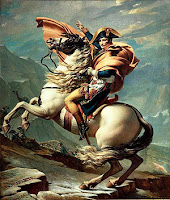
| David's "Napoleon Crossing the Alps" |
Jeff studied at Atelier Lack, a program that "focuses primarily on teaching fine draftsmanship and painting skills leading to the creation of well constructed artwork." What's cool is that the instructional lineage of the school can be traced back to the Neo-Classical artist Jacques-Louis David who painted, among other famous works, "Napoleon Crossing the Alps."
 |
| Jeffrey Larson's "Electrolux" |
So it comes as no surprise that Jeff is a representational artist focused on the craft of painting (although you might not put his "Electrolux" up against David's "Death of Marat" and immediately see the connection.) As an aside, when asked about the painting, Jeff shared that his mother-in-law had told him and his wife Heidi that if they ever came across an Electrolux, they should snap it up. They found one at a garage sale and did as instructed. Although it didn't work well as a vacuum cleaner, Jeff found the streamlined design of the machine an interesting subject.
Jeff's first introduction to the 134 works he had chosen for this year's show (from a field of 633) came when he and Heidi walked into a gallery overflowing with artwork. Paintings hung in a haphazard fashion on the walls; some were on the floor leaning. Despite the chaos, a smile broke out across his face as he saw the artwork he'd previously viewed in 3x3 thumbnail photos online. He was happy with his selections. "Every work," he said, "Has something, a little spark."
 |
| Anna Bain "Self-Portrait in the Studio" |
The hardcore judging took place the next morning, which Jeff spent studying the works and eliminating. Eventually, the only paintings hanging were those he was considering for a prize. Co-chair Ingrid Carroll's and my job was to be on hand to answer basic questions -- more or less to be flies on the wall as the judge went about his business. But Jeff was downright voluble as he shared his thoughts with us about different works.
He turned Anna Bain's "Self-Portrait in the Studio" upside down to look at the composition. (I'd seen this trick before in a critique session, but it's always striking. It was funny when someone came into the gallery and said, "Well, I guess that work's out of the running." Au contraire.) He loved the work's balance and the way all lines led to the artist's face. The work received Second Prize in the show.
 |
| Dominic Avant "Pizzicatto" |
He talked about his characterization of Dominic Avant's "Pizzicatto" as a genre piece rather than a portrait. Knowing that Dominic's 14-year old son had sat for this painting, I was curious about the difference. In a portrait, he said, your focus is on the individual. Who are they? What are they thinking? In a genre work, the focus is on the setting, the activity. The motion of the cellist's hand as he plucks the strings draws the viewer's eye rather than his face. The work received Third Prize in the show.
 |
| Bill Farnsworth "On the Line" |
Bill Farnsworth's "On the Line," which won Best of Show, captured Jeff's attention because of the way the artist created different points in the painting that draw the viewer's eye in. Some paintings, though skillful, lead your eye off the canvas and onto the next work. Farnsworth's dollops of light and the sense of movement from the waves force the viewer's eye to keep circling around and considering the work. It's a manipulative artistic technique that an uneducated viewer (like me) might not even realize is happening.
 |
| James Wolford's "Friendship House" | |
It was interesting to hear Jeff comment that he could tell certain works had been painted from a photograph. How did he know, you might ask (as I did). Jeff pointed out that when the human eye is looking at, say, a house, you focus on one point and the hard edges soften. (He referred to them as "lost edges.") In James Wolford's "Friendship House," the rooflines are uniformly distinct, a sign the artist painted from a picture (after, Jeff was certain, many studies of the work). Photo-realistic paintings are neither good nor bad, just a technique that the viewer might appreciate. (While "Friendship House" did not win a prize, Wolford's "USS Constitution" garnered an Excellence Award.)
The National Art Exhibition will be on display at the Visual Arts Center through March 12. If you're in the area, it's a show worth seeking out -- even if you don't have the benefit of Jeff Larson's commentary along the way. And for a bit more insight into the show, check out Nancy Stetson's article in Florida Weekly:
A Good Year for Art.


No comments:
Post a Comment